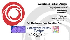
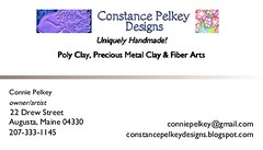
The second one. I mean I like the gray swirl on the first one but that red is evil. it so clashes with the other colors. I like the layout of the second one. neat, clean, precise and looks damn professional.
Thanks Kath,I like the grey too, but the red comes with it on the template from staples.com.I think it's going to be the second one! :)
Post a Comment

2 comments:
The second one. I mean I like the gray swirl on the first one but that red is evil. it so clashes with the other colors. I like the layout of the second one. neat, clean, precise and looks damn professional.
Thanks Kath,
I like the grey too, but the red comes with it on the template from staples.com.
I think it's going to be the second one! :)
Post a Comment